")
In this article, we’ll cover:
- What makes a great event registration form (and what kills conversion)
- The essential fields every event registration form needs
- How to build your form step by step using an event registration tool
- Design and UX best practices to increase completions
- Common mistakes to avoid when creating registration forms
Why Your Event Registration Form Makes or Breaks Attendance
Your event registration form is the front door to your event. If it’s clunky, confusing, or asks for too much information, attendees will abandon it before they ever hit “submit.” And you’ll never know how many people you lost.
A well-designed event registration form does more than collect names and email addresses. It sets the tone for the entire attendee experience, gathers the data you actually need for planning, and makes signing up feel effortless. Whether you’re running a 50-person workshop or a 5,000-person conference, the registration form is where your relationship with every attendee begins.
The good news? Building an effective form doesn’t require a design degree or a development team. With the right event registration software and a clear plan, you can create a registration form that converts visitors into confirmed attendees in minutes.
This guide walks you through every step.
Step 1: Define What Data You Actually Need From Your Event Registration Form
Before you touch a form builder, sit down and answer one question: what information do you need to run this event well?
Most event planners default to asking for everything. Job title, company, dietary restrictions, t-shirt size, emergency contact, how they heard about the event, their favorite color. The impulse makes sense. More data feels like better preparation.
But every additional field you add to your event registration form lowers your completion rate. Research consistently shows that shorter forms convert better. The sweet spot? Five to seven fields for most events.
Start with the non-negotiables:
- Full name (first and last, as separate fields)
- Email address (your primary communication channel)
- Ticket type or session selection (if applicable)
Then add only what you’ll genuinely use:
- Company and job title (useful for B2B events, networking features, and badge printing)
- Dietary restrictions (only if you’re serving food)
- Accessibility needs (always include this, even as an optional field)
- Custom questions tied to your specific event (session preferences, experience level, workshop choices)
💡 Pro tip: If you’re unsure whether to include a field, ask yourself: “Will I use this data in the next 30 days?” If the answer is no, leave it out. You can always collect additional information in a pre-event survey closer to the date.
Step 2: Choose the Right Event Registration Tool
Your event registration form is only as good as the tool behind it. A basic Google Form might work for an internal team lunch, but for professional events, you need an online event registration platform that handles payments, confirmations, waitlists, and data management.
Here’s what to look for in an event registration tool:
- Drag-and-drop form builder so you can add, remove, and reorder fields without writing code
- Custom branding options to match your event’s look and feel
- Payment processing built in (not bolted on as a separate step)
- Automatic confirmation emails triggered the moment someone registers
- Data export and integration with your CRM, email marketing, or event management tools
- Mobile-responsive forms that look great on any device
- Conditional logic that shows or hides fields based on previous answers
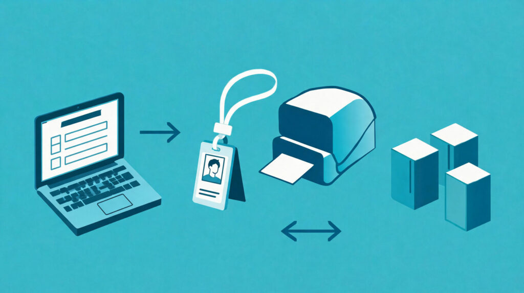
Platforms like Expo Pass offer all of this in a single dashboard, connecting your registration form directly to check-in, badge printing, and attendee communication. That means the data someone enters on your form flows all the way through to the day of the event without manual re-entry.
If you’re evaluating options, our breakdown of the best event registration software compares features, pricing, and use cases across the top platforms.
For teams working with limited budgets, there are also free event registration platforms worth exploring, though they come with trade-offs in customization and support.
Step 3: Structure Your Event Registration Form for Conversion
Now that you’ve defined your fields and chosen your tool, it’s time to build. The structure of your event registration form matters just as much as the content.
Lead with the easiest fields. Name and email should always come first. These require zero thought from the registrant and create a sense of momentum. Once someone has typed their name and email, they’re psychologically invested in finishing the form.
Group related fields together. Keep personal information (name, email, phone) in one section, event preferences (ticket type, sessions, dietary needs) in another, and payment at the end. Clear visual grouping helps registrants understand where they are in the process.
Use a single-page layout for short forms. If you have fewer than eight fields, keep everything on one page. Scrolling is easier than clicking through multiple steps.
Use a multi-step layout for longer forms. If your event requires more data (think: multi-track conferences with session selection, meal choices, and add-ons), break the form into logical steps with a progress bar. Each step should feel completable in under 30 seconds.
⚡ Practical Advice: Add a progress indicator (e.g., “Step 2 of 4”) at the top of multi-step forms. Registrants who can see the finish line are far more likely to complete the process.
Step 4: Write Clear Labels and Instructions
Ambiguous form fields are conversion killers. If a registrant has to pause and wonder what a field is asking for, you’ve introduced friction that didn’t need to exist.
Follow these labeling best practices for your event registration form:
- Use plain language. “Full Name” not “Registrant Identifier.” “Email” not “Electronic Correspondence Address.”
- Put labels above fields, not beside them. Top-aligned labels are easier to scan, especially on mobile.
- Mark required fields clearly. Use a red asterisk (*) or the word “Required.” Don’t make people guess.
- Add helper text for anything non-obvious. If you’re asking for a promo code, add a small note like “Enter your discount code if you have one. Leave blank otherwise.”
- Use placeholder text wisely. Placeholder text (the greyed-out text inside a field) works well for format hints (“e.g., jane@company.com”) but should never replace the actual label, because it disappears once someone starts typing.
Keep the language warm and direct. Your registration form is a touchpoint, not a government document.
Step 5: Configure Confirmation and Communication
Registration doesn’t end when someone clicks “Submit.” What happens next shapes their first real impression of your event.
Set up an automatic confirmation email that triggers immediately after registration. This email should include:
- A clear “You’re registered!” message
- Event name, date, time, and location (or virtual link)
- Their ticket type or registration details
- A calendar invite link (.ics file or “Add to Google Calendar” button)
- Contact information for questions
- Any next steps (download the app, book travel, join a community group)
Set up reminder emails at key intervals: one week before, one day before, and the morning of (for virtual events). These reminders reduce no-shows and keep excitement high.
✨ Expert Advice: Personalize your confirmation email beyond just the registrant’s name. Include their specific session selections or ticket type. It shows you’re organized and reinforces that their choices were captured correctly.
Step 6: Test Your Event Registration Form Before Launch
Never publish a registration form you haven’t tested yourself. This sounds obvious, but it’s skipped more often than you’d think.
Run through this testing checklist before you share the link:
- Complete the form yourself on desktop and mobile
- Submit a test registration and verify the confirmation email arrives
- Check every conditional field by selecting different ticket types or options
- Test the payment flow with a real or test transaction
- Try abandoning the form midway and returning to see if data is saved
- Check the form on multiple browsers (Chrome, Safari, Firefox, Edge)
- Verify data exports correctly into your event management dashboard or CRM
- Ask a colleague to fill it out and time how long it takes (aim for under 3 minutes)
If any step feels awkward, confusing, or slow, fix it before launch. Every second of friction costs you registrations.
Step 7: Promote and Embed Your Event Registration Form
Your form is built, tested, and ready. Now you need to get it in front of the right people.
Embed the form directly on your event page. Don’t make people click through to a separate registration page if you can avoid it. An embedded form reduces clicks and keeps visitors on your site. Most online event registration tools let you embed forms with a simple code snippet or iframe.
Share a direct registration link across your marketing channels:
- Email campaigns with a clear CTA button (“Register Now”)
- Social media posts with the link in the first comment or bio
- Partner and sponsor communications so they can share with their networks
- Your website’s navigation or banner during the promotion window
Track where registrations come from. Use UTM parameters on your registration links so you know which channels are driving sign-ups. This data is gold for optimizing future event promotion.
💡 Pro tip: Create a unique registration link for each promotional channel (email, LinkedIn, partner email, paid ads). When you can see that LinkedIn drove 200 registrations and your email campaign drove 800, you know exactly where to invest next time.
Common Event Registration Form Mistakes to Avoid
Even with the right tool and a solid plan, small mistakes can quietly erode your conversion rate. Here are the most common pitfalls:
- Asking for too much information upfront. Collect only what you need at registration. Gather the rest later through pre-event surveys or at check-in.
- Burying the registration link. If visitors can’t find your form within two clicks of landing on your event page, it’s too hidden.
- Skipping mobile optimization. More than half of event registrations happen on mobile devices. If your form doesn’t work flawlessly on a phone, you’re losing registrants.
- No confirmation email. People expect instant confirmation. Silence after submitting a form creates anxiety and support tickets.
- Ignoring accessibility. Your event registration form should be navigable by keyboard and compatible with screen readers. This isn’t optional.
- Using generic error messages. “Error: Please fix the highlighted fields” is unhelpful. Tell people exactly what’s wrong: “Please enter a valid email address.”
Avoiding these mistakes doesn’t add complexity. It just requires attention and a quick review before launch.
Final Takeaway
A great event registration form is simple, focused, and built with your attendee’s experience in mind. It asks only for what’s needed, makes the process feel effortless, and sets the stage for a well-organized event from the very first interaction. Start with your data needs, choose the right event registration tool, structure your form for conversion, test it thoroughly, and promote it everywhere your audience lives. Do that, and you’ll turn your registration form from a necessary step into a genuine competitive advantage.
Frequently Asked Questions
What fields should every event registration form include?
At minimum, every event registration form should capture the registrant’s first name, last name, and email address. Beyond that, include ticket type or session selection if your event offers options, and an optional accessibility needs field. Additional fields like company name, job title, and dietary preferences depend on your event type. Keep the total field count between five and seven for the best completion rates.
Can I create an event registration form for free?
Yes. Several platforms offer free tiers for basic event registration, though they typically come with limitations on customization, attendee caps, or payment processing. For simple events with straightforward needs, a free tool can work well. For professional or larger-scale events, investing in a paid online event registration platform gives you features like custom branding, conditional logic, and integrated check-in.
How do I increase my event registration form completion rate?
Focus on reducing friction. Keep the form short (under seven fields if possible), use clear labels and instructions, make the form mobile-responsive, and lead with easy fields like name and email. Adding a progress indicator for multi-step forms and providing a clear confirmation message after submission also helps. Test the form on multiple devices before launch to catch usability issues early.
Should I use a single-page or multi-step event registration form?
It depends on how much data you’re collecting. For simple events with fewer than eight fields, a single-page form works best because it minimizes clicks and keeps the process fast. For complex events with session selection, meal choices, add-ons, or multiple ticket types, a multi-step form with a progress bar prevents the form from feeling overwhelming. The key is making sure each step feels quick and manageable.
How do I connect my event registration form to my CRM or email tool?
Most modern event registration tools offer native integrations or API connections with popular CRMs (Salesforce, HubSpot) and email platforms (Mailchimp, Constant Contact). Look for a platform that supports the integrations you need out of the box, or one that connects through tools like Zapier. The goal is automatic data flow so you’re not manually exporting and importing spreadsheets between systems.