Introducing the unsung hero of your events—the name badge! This small-but-mighty element of event planning features basic information like an attendee’s name, position, and access level. It may seem like it’s all about identification, but it can pack a bigger punch if you design it right.
There are more factors to consider than font or text size. But don’t stress, we’ve designed a name-badge boot camp that’ll whip your creativity into shape! Read on for everything you need to know about creating a clear (and fun!) event badge.

Start with your goals.
A name badge is really about two things; providing information about attendees and encouraging networking opportunities between them, the speakers, and anyone else at the event. Keep these goals in mind and you won’t go crazy.
Networking is one of the biggest draws for attendees, so you want to make it as easy as possible for them to meet, greet, and get to know each other. It’s all about clarity. Make it easy for attendees to identify each other’s role by including job title and company info. This taps into the real power of name badges!
You don’t want attendees going on a visual scavenger hunt when trying to identify their fellow guests. Positioning key info below the attendee’s name will place it in the natural path of the eye, as they read from top to bottom. This also makes it easier for staff to identify who is and isn’t a part of the event—say goodbye to those unwanted event crashers!

Highlight the name.
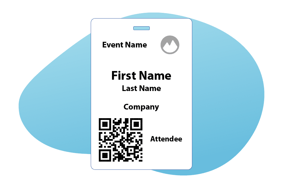
Start the badge design process with the name and its placement. Typically, a name badge will include the first and last name, but believe it or not, the first name is most important. Our full name is really only used if we’re famous or are being yelled at by our mothers.
A high-quality badge allows for the attendee’s first name to be visible from a distance (roughly 10 feet away), so size it accordingly. No need to get wild with fonts, the simpler the better to avoid confusion. This makes identification effortless and is a quick save if you forget the name of a new contact. To those who are bad with names, we see you!
Make the first name the focal point by placing it near the top of the badge on a line of its own. This text should be the biggest, making it the most prominent feature of the name badge. It’ll draw the eye like a Times Square billboard! The last name should appear on a line of its own
under the first name, never as large or as bold. With this simple design approach, you’ll reduce confusion and boost networking opportunities between attendees!
Capitalize on your space.
As anyone in real estate knows, it isn’t about how much space you have, but how you use it. Let’s assume your event badge is roughly 4”x6,” so you don’t have acres of land to play with. Start with the size of the name and build the rest of your design around it.
You can include the event title, brand logos, and other information, but make sure it isn’t larger than the name. Think about the other elements of the badge as supporting the star of the show—the attendee’s name. If your badge looks too cluttered, consider removing elements to avoid overwhelming the senses. It’s all about balance.
Less is more, and if you’re going to include branding, keep it to the corners. This can actually highlight the name by placing it in a “frame” of information. There’s no need to worry about making sure this info can be seen from far away. If attendees want to check out the sponsors or event name, they can look down at their own badge.
Including key sponsors can be an effective usage of extra space, if you’ve got it. Attendees will be consistently, subliminally reminded of these brands throughout. Use this tactic to sweeten a deal with sponsors you really want to work with. Talk about the power of real estate!
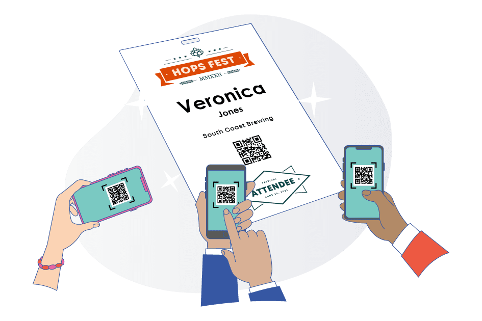
The QR is the co-star.
Take your badge game to the next level by using QR codes. After the attendee’s name, a QR code is the next most important element. Think of it like the magician’s assistant, not the star of the show but just as important to a successful event.
These don’t just benefit attendees, but you as well! You can improve attendance tracking and exhibitor lead retrieval by including a QR code. You can also include a map of the event space, a schedule of keynotes, or contact information via the QR code, improving the overall attendee experience. It’s the miracle of technology!
Here’s where things get tricky. When introducing a second prominent item to your badge, you want to make sure you don’t have the two items competing for attention or creating a cramped appearance. If you’ve placed the name near the top, place the QR code near the bottom to make sure that each has its own space.
Just like the name, distance matters. While you don’t need to make it workable from ten feet away, you do want to make sure the QR code can be scanned from a relative distance. While we want to foster connections, we don’t want to force our attendees to pop each other’s personal bubbles!

The don’ts of badge design.
Now that we’ve talked about some of the “dos” let’s cover the “don’ts.” Keeping these things in mind will ensure your badge, and your event, looks clean and professional. No one wants to look like a rookie!
We’ve already mentioned that making the last name larger than the first is a no-go, but it’s just as tacky to place the first and last name on the same line. By dividing the two elements of attendee names up, you’ll keep the edges of the badge from looking cramped while avoiding spacing issues with long names.
We LOVE creativity, but save it for other parts of your planning. Avoid fancy, hard-to-read fonts that may look exciting but will make it difficult to read at a distance, or even up close! Stick with simple fonts like Ariel or Open Sans for a bold and easy-to-read design.
Similarly, avoid using too many colors or overly complex borders on your event badge. While a bit of flair can frame the information and give your badge a playful pop, too much can be distracting. Think of the badge design like a good story. You want it to flow, from top to bottom. All the information should be easily absorbed on the first look.
Spice it up.
I know, we just said to keep a leash on your creativity. However, there is one area on your badge where you can indulge your imagination—the back!
You probably thought you’d keep that blank, right? If you’re using a badge with a single notch in the middle, chances are that it’s going to swing around throughout the day. Even though it’s technically the “back,” that doesn’t mean it won’t get ample Facetime.
This is the chance for your marketing team to have some fun! Add custom-designed artwork, or a variety of unique designs that can act as a conversation starter for attendees. Remember when Life Water first hit the scene? Each had an animal-related pun inside that sparked conversations. You can tap into a similar playfulness here!
This is great real estate for sponsors to get in on the action. Sell the space to the highest bidder as a way to raise more capital or to seal a deal with a desired company or supplier. They get constant promotion and you get a creative backing for your event badge; it’s a win-win!
You can still have fun with the back of badges with two notches, even though they won’t spin. If you know the venue’s wi-fi password, this is a great place to include it along with the Event Organizer’s contact info. If you have event-exclusive hashtags, include them here to encourage attendees to share their experience. #GENIUS!
The final secret.
While keeping these tips and tricks in mind, don’t forget the most important element of badge design—have fun!
Think of it as an opportunity to showcase the personality of your event while conveying important information to attendees and staff. Once you’ve made sure that all information is easy to read and has a simple, easy-to-understand flow, you can indulge in a little creative play. It’s all about finding the right balance between fashion and function.
Now that you know what to do, it’s time to get to designing!
Interested in having customizable badges at your event? Learn more about Expo Pass Check-In and Badge Printing features here, or send us a message at info@expopass.com.