Your event website should be built with the user experience in mind. This is the surest way to convert site visitors into paying customers. Event websites are unique in that your users are already in the mood to buy. You just have to convince them to buy from you. Here are things you can do to achieve that.
Excite Them With Colors
Think about your audience. They’re on your site because they’re excited about the idea of attending a live event. It doesn’t happen everyday. Usually they just come home from work, eat supper, watch a movie and hit the hay. But now they’re thinking about the prospect of actually doing something noteworthy. So would you want this first step in their experience to be just ho hum? No way!
You need to match your users’ level of enthusiasm with some fun and energetic colors! Kind of like that exclamation point. Got you excited, right? That’s what you need to do with your website, and colors is the easiest way to achieve it. Consider really bright reds and purples. These are traditionally “passion” colors. Or you could infuse fuchsia pinks and neon greens. You could even use bright yellow as the background color for a header. Everywhere your user looks, they should be excited by the colors.
Blast Them With Buttons
Okay, don’t actually “blast” your users. That would be off-putting. But you should make it super easy for them to click to buy. After all, that’s the whole point, right? And it’s not just your purpose. Your users want to buy. They want to find what they’re looking for and make this a done deal. So you’re both operating with the same goal. Why not make it easy for both of you to get what you want? Otherwise, the second a user has to go searching around your site for it, there’s a chance you’re going to lose them. Registration buttons should be in multiple locations on your website.
This includes at the very top of the home page, near the navigation. Another button should be near every event description. Another button should be on the contact page. Now, you also don’t want to “blast” your users with a pop up registration button. They need to read the info on the page, and a pop up is just literally getting in the way of what they want. They have to make sure they’re buying the right ticket for the right date.
Don’t make things confusing by throwing confetti in their face in the form of a pop up. By the way, remember those colors we talked about? Your registration buttons should all be the same awesome color. It’s called object identification. Once your user sees one registration button, they’ll automatically be better able to see the other buttons when they all look the same. For best effect, don’t use that registration button color anywhere else on the site. If you have to, you could add a pattern to the color to make it stand out even more.
Make It Mobile
In this day and age, you shouldn’t have to be reminded about making your event website mobile. However, this can be tricky if you have any links to other sites. Say you’re selling tickets to a concert by a well-known motivational speaker. You want to add value to your users’ experience so you link to that speaker’s personal website. Unbeknownst to you, that speaker’s website isn’t mobile-friendly.
So now your user has gone off to the land of the world wide web and gotten lost on a site that isn’t giving them a good feeling. What are the odds they’ll come back to your site? Not that great. A better way is to ensure your own site is mobile for tablets and phones, but then don’t link to outside sites unless they’re mobile, too. Even better is just rewriting content so your user never has to leave your site to get the background information on the event they’re interested in.
Let Them Scan
Speaking of content, make sure you offer a scannable experience. A lot of your users will already have heard of the event and they know exactly what they want. For those users, you should have scannable text with headers and bullet lists. Statistics say you have less than a minute to engage or your user will be out the door. So make the scannable text really pop.
Make every word count. Think of it like a newspaper headline, as if you had limited space to communicate the information. That’s how you want your text to be on your event website. For those who want additional information, you can have an accordion text block that they can click for “more info.” That way you satisfy both kinds of users’ needs without cluttering up your pages.
Form and Function
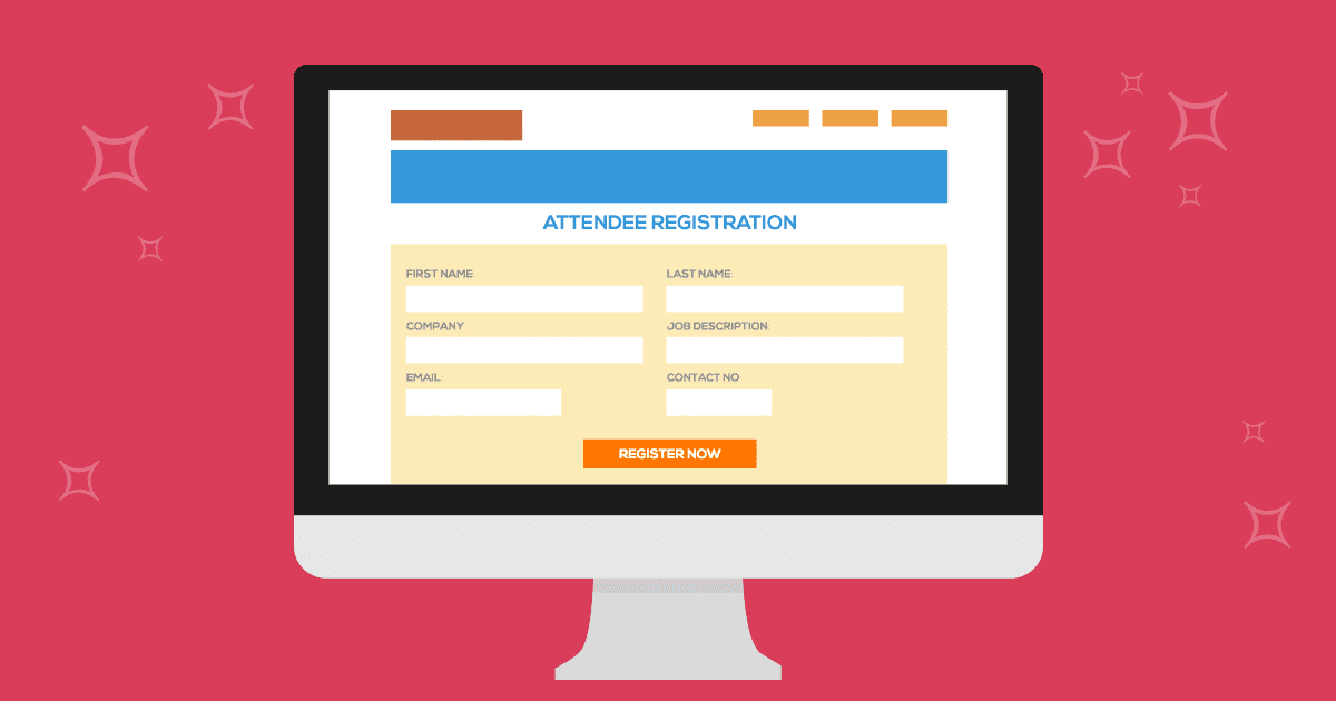
Your registration form design should match the style and look of your website. There’s nothing worse than a beautifully designed website that sends people to a registration form that looks like it was built in the 1990’s. Make sure to find a registration provider that offers the option to embed the form into your website. In addition make sure that form is mobile responsive.
If you choose to send your prospective attendees to a third party registration page, make sure you can customize the look and feel to match your branding. Bonus points if you find an intuitive registration provider that can provide you with options and functionality including lightbox, and abandoned cart data.
Don’t leave your website design up to chance. Even if you aren’t the one who’s actually building the site, you can ask your web designer to incorporate these ideas into your event site. Doing so will likely boost your conversion rate and keep your users returning every time they want to attend a live event.

